The White Lotus House — a ‘modern paradise’ — lists in California.
Updated: Aug 8, 2025

Talk about a jaw-dropper. A mansion that will make you feel like you’re vacationing at a high-end resort — or rather, the resort that is at the center of a popular HBO series — has landed on the real estate market in Los Angeles.
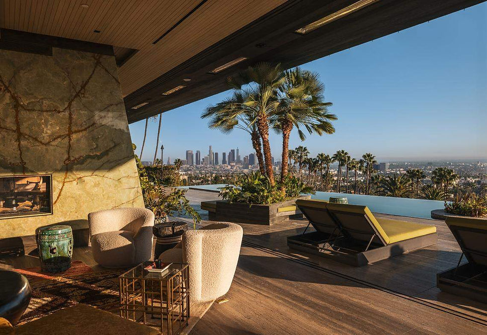
“Presenting the White Lotus House, an architectural modern paradise meticulously constructed over seven years, utilizing the finest materials and millions just in stonework alone. The only budget was there was no budget; everything had to be the best,” the listing on The Beverly Hills Estates says.

The 13,000-square-foot residence is listed for $34.995 million. “Combining modern new construction with the retro charm of the golden age, embracing the rich history of Hollywood and the lifestyles of its icons. Designed with Asian influences to make you feel like you’re living in paradise,” the listing promises.

Dubbed the White Lotus House, the property at 1851 Stanley Ave. in Los Angeles is an architectural modern paradise meticulously constructed over seven years.
There are also surprises around nearly every corner of the six-bedroom, 10-bathroom estate, including a private speakeasy nightclub and over-the-top views of downtown Los Angeles.
The home belongs to developer and The Beverly Hills Estates agent Branden Williams, who dubbed the home after the drama series about guests and staff at a specific luxury resort chain. “We’ve been showing the house, and people were like, ‘This looks like ‘The White Lotus,’” Williams told Homes.com in May. “It’s a resort sexy feel.”

“The only budget was there was no budget; everything had to be the best,” according to a property description from listing agency The Beverly Hills Estates.
The listing is held by Williams and his wife, Rayni Williams.
Author: TJ Macias
July 1st, 2025
Photos: Branden Williams & Jonny Marlow


kèo nhà cái 5 chuẩn mình thấy bạn bè nhắc nhiều quá nên bấm vào coi thử cho biết. Mình cũng không rảnh đọc kỹ đâu, chủ yếu lướt xem giao diện có dễ chịu không thôi. Vừa vào là thấy trang nhìn khá thoáng, chữ không bị dồn dập nên kéo xuống cũng nhẹ đầu. Mấy nội dung họ chia thành từng khối riêng, nhìn phát là biết phần nào ra phần đó, khỏi phải căng mắt tìm. Mình thích nhất là cái menu để ngay chỗ dễ thấy, bấm qua lại giữa các mục không bị lạc hay phải quay lại hoài. Nói chung lướt nhanh tầm vài phút là nắm được ý chính, nhờ bố cục chia…
Bài viết dễ theo dõi, đọc mạch lạc nên mình hiểu nhanh hơn, cảm ơn bạn đã chia sẻ. Mình thì ngày nào cũng ngó thống kê XSMB một chút, nên tiện tay gom lại thành một trang tổng hợp để tra cho đỡ mất thời gian. Ai cũng hay xem số liệu cập nhật theo ngày thì ghé qua https://soicauxsmbpro.wordpress.com/2026/08/03/soi-cau-xsmb/